8 Trending Streetwear Color Palettes
Streetwear lives or dies on the details, and color is usually the first one people feel before they name it. The right trending streetwear color palettes can make a relaxed hoodie look intentional, turn simple joggers into a full fit, and give even the cleanest basics that no-apologies energy. When the silhouette is minimal, the palette has to carry attitude.
This season, the strongest color stories are not random. They balance wearability with presence. They work across heavyweight sweats, cropped layers, clean tees, headwear, and sneakers without looking overworked. Some are quiet. Some hit hard. The common thread is confidence.
Why trending streetwear color palettes matter
Streetwear has always been about more than matching pieces. It is about signaling taste, mood, and belonging without explaining yourself. Color does that fast. Before anyone notices the embroidery, the fit, or the fabric weight, they clock the palette.
That is why the best palettes do two jobs at once. They make a look easy to style, and they build identity. A strong palette can stretch a smaller wardrobe further because every piece starts speaking the same language. It also helps statement branding land better. Red on black feels different from cream on faded olive, even if the logo placement never changes.
There is a trade-off, though. The louder the palette, the shorter the runway for everyday wear if the pieces are not grounded well. On the other side, all-neutral fits can look premium or flat depending on texture, weight, and contrast. Color never works alone. It works with fabric, finish, and fit.
8 trending streetwear color palettes defining the moment
1. Washed black, charcoal, and faded gray
This is the backbone palette for a reason. It feels lived-in, sharp, and easy to repeat. Washed black keeps the look from feeling too polished, charcoal adds depth, and faded gray breaks it up without softening the edge.
It works especially well in heavyweight hoodies, oversized tees, sweat shorts, and beanies. The appeal is that nothing looks too precious. You can stack tones in one fit and still look clean because the variation comes from wash and texture, not loud contrast.
The risk is monotony. If every piece sits in the exact same dark range, the outfit can feel flat. The fix is simple - mix matte and brushed finishes, or add one sharp detail like white socks, silver hardware, or a small hit of red embroidery.
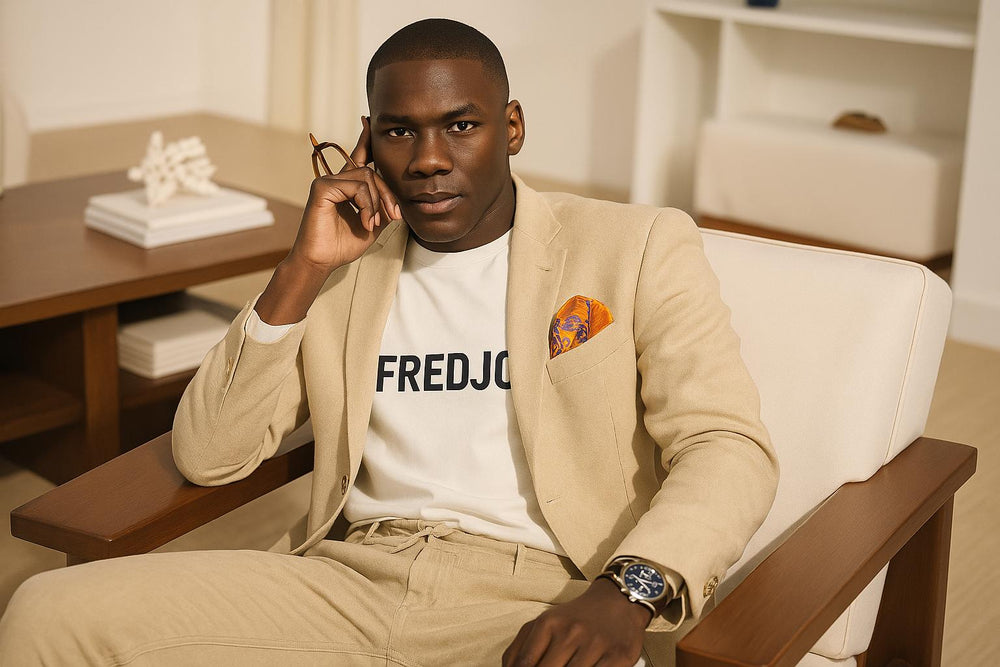
2. Bone, cream, sand, and stone
Not every powerful fit has to be dark. Soft neutrals are hitting hard because they bring premium energy without trying too hard. Bone and cream look elevated on clean fleece and heavyweight cotton, while sand and stone keep the look grounded.
This palette is strong for matching sets, especially when the fit is relaxed and the branding stays minimal. It also moves well from street to off-duty. A cream sweatshirt with stone joggers feels intentional enough for outside and comfortable enough for everyday rotation.
The catch is upkeep. Light tones show wear faster, and cheaper fabrics can look thin instead of luxe. This palette needs substance. Weight, structure, and finish matter more here than they do with black.
3. Olive, moss, and military green with black
Utility colors never really leave streetwear, but right now they feel cleaner and more refined. Olive and moss bring that field-jacket toughness, while black sharpens the whole look. It is a palette that says function without going full costume.
This one shines in jackets, cargos, caps, and layered sweats. A moss hoodie under a black outer layer feels strong without looking obvious. It also works for people who want color but do not want brightness.
Where it depends is skin tone and styling. Some greens can read muddy if the wash is off. The best versions have either a deep richness or a slightly faded military cast. Anything too shiny tends to lose the point.
4. Black, red, and off-white
Few combinations hit as instantly as black and red. Add off-white instead of pure white, and the palette gets more depth and less harshness. This is bold streetwear at its cleanest - minimal design up front, maximum attitude once the color contrast lands.
It is perfect for logo hits, embroidery, varsity-inspired details, sneakers, and hats. Red carries emotion. On black, it feels direct. On off-white, it feels deliberate. That contrast makes even a simple hoodie feel like a statement piece.
The trade-off is obvious. This palette is memorable, which is great when you want presence, but it can feel repetitive if every drop leans on the same formula. The strongest move is using red as punctuation, not flooding the whole fit with it.
5. Navy, ice blue, and white
Blue is having a strong run in streetwear because it gives calm confidence instead of forced energy. Navy anchors the look, ice blue keeps it fresh, and white adds the clean finish. Together, they feel sporty, modern, and easy to wear.
This palette works across zip hoodies, track-inspired pieces, graphic tees, and sneakers. It also photographs well, which matters more than people admit when a fit is built for both real life and social feeds.
Still, there is a fine line between crisp and too athletic. If every piece feels performance-driven, the streetwear edge can disappear. The move is to keep silhouettes relaxed and fabrics substantial, so the palette reads premium instead of gym-adjacent.
6. Brown, espresso, and clay
Earth tones have moved from niche to essential. Brown, espresso, and clay feel rich, grounded, and mature without losing edge. They bring warmth to oversized silhouettes and look especially strong in fall, but they are not locked to one season anymore.
A clay tee under an espresso hoodie, or brown sweats paired with tonal headwear, creates depth without loud contrast. This is a palette for people who want to stand out quietly. It feels less expected than black and more directional than standard gray.
The challenge is balance. Too many mid-browns together can feel heavy. Break them with cream socks, a white tee collar, or a darker outer layer to keep the fit moving.
7. Slate, concrete, and muted blue
This palette sits in the space between industrial and refined. Slate and concrete bring that urban edge, while muted blue stops the fit from feeling cold. It is ideal for clean layering and understated branding.
The appeal here is subtlety. You are not chasing attention with bright color. You are building a look that holds up close. It works well for people whose style leans minimal but still wants texture and mood.
Because the palette is restrained, fit becomes everything. If the proportions are off, these colors will not save the outfit. But when the cuts are right, the whole thing looks expensive.
8. Butter yellow, soft lavender, and washed cream
Streetwear is also making room for lighter, more expressive tones, and this is where things get interesting. Butter yellow, soft lavender, and washed cream bring a fresh shift from the usual dark-heavy rotation. They feel creative, confident, and a little unexpected.
This palette works best when the garments stay simple. Let the color do the talking. A clean tee, relaxed hoodie, or cap in one of these shades can lift a full look without turning it into a costume.
It is not for every mood, and that is the point. These colors are strongest when used with restraint. One soft statement piece paired with grounded neutrals usually lands better than wearing all three at once.
How to choose the right palette for your fit
The best palette is not always the loudest one. It is the one that fits how you actually dress. If your closet is built around daily essentials, washed darks, soft neutrals, and olive-based tones will give you the most mileage. If you like your clothes to lead the room, sharper contrast palettes like black, red, and off-white will do more work.
Start with the piece you wear most. For some people, that is a hoodie. For others, it is a tee, cargo, or hat. Build around that category first. If your go-to item looks strongest in heavyweight black fleece, your accent colors should support that. If you live in cream sweats and neutral sneakers, your palette should stay in that premium, tonal lane.
Texture matters too. A color can feel completely different on brushed fleece than it does on nylon or ribbed cotton. Even the same shade of gray changes depending on whether the fabric is washed, structured, or glossy. That is why strong streetwear styling always goes beyond the swatch.
The real shift behind trending streetwear color palettes
The current moment is not just about what colors are hot. It is about control. The strongest fits look edited, not accidental. People are buying fewer throwaway pieces and paying more attention to what works across drops, across seasons, and across moods.
That is where brands like Fred Jo Clothing sit naturally - in that space where comfort, weight, and clean design meet color stories with presence. A good palette does not need to scream to make a point. It just needs to feel honest when you put it on.
Wear the colors that make your basics look deliberate and your statement pieces feel earned. If the palette sharpens your confidence the second you catch your reflection, that is the one worth repeating.

Hinterlassen Sie einen Kommentar